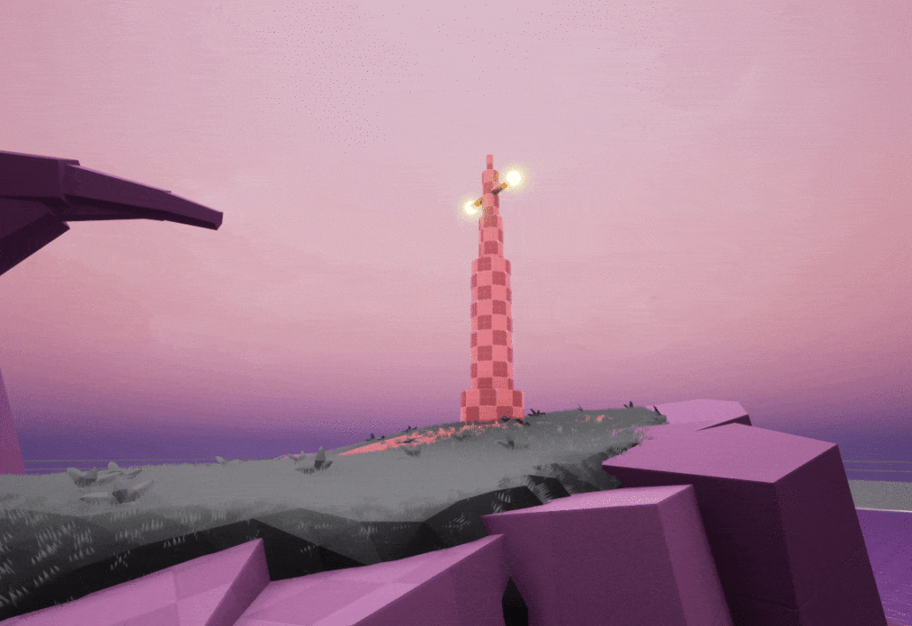
Engine : Unreal Engine
Project type : Composition work / vista
Time of completion : Half a day
Status : Finished
This is the first work of a serie I’m starting!
A quick and fun exercice in which I craft simple blockouts with a focus on composition and visual language.
Learning objective?
I love learning about composition so I wanted to improve my skills at making nicely crafted spaces by tackling new challenges!
Therefore, this serie will have a strong focus on visual language, spatial building and saliency.
I pick a random word that could be translated as a subject in space
I make a list of composition elements/concepts I’ll work with
Word generated for this exercice :
Mandatory base composition elements :
Use of rule of thirds for subject
S curve pathing
Denial & Reward
Visual pointers (Various sizes)
Framing / Reveal
Understanding of the subject :
From the word I picked, I quickly thought of a lighthouse kind of scenery.Something about an object timelessly standing in front of the ocean is something that makes me feel loneliness.
So I chose this kind of overall picture as my subject!
Starting with simplicity :
I started working by having a 2D approach to the framing I wanted to have, at first containing simple shapes.
The iterations consisted of adding details and volume to the space with sketches, done on Clip Studio. Color is used to highlight what was important in this composition.
Throughout my process, I used to draw on top of my screenshots to clarify the shapes that would make the frame easier to read.
I shaped the path as an S-curve creates rythm and guidance in the picture.
As opposed to the bumpy rythm that comes with rock shapes, the main path catches the eye because of its soothing lines.
Once this shape attracts the player’s attention, following it is an interesting journey, ultimately leading to the composition’s subject.
By adding environment blocking player’s view of the path leading to their target, it can encourage player’s curiosity and involvement.
The player would mentally connect the path as to be leading to the Pole but preventing them to see the connection brings intrigue and even momentary lostness.
This makes the journey towards our subject more interesting and our arrival more rewarding.
The subject is critical in our zone/composition so I wanted it to be near unmissable.
I chose to add lights glowing and pulsing from it.
Light & movement attracts the player’s gaze extremely effectively, especially when other elements are making it stand out.

I used very basic shapes to build the composition.
The round shape is used to guide the player’s eye around the frame, leading finally to the subject.
The triangle one is used to visually deny the path.
Everywhere in the frame, visual pointers and leading lines are created to either guide the player’s eye directly toward the subject or making it ‘enter’ this circular movement, leading to it in the end.
WIP